Interactive Mapbox visualization of BlueBike station demand with time filtering and isochrone overlays.
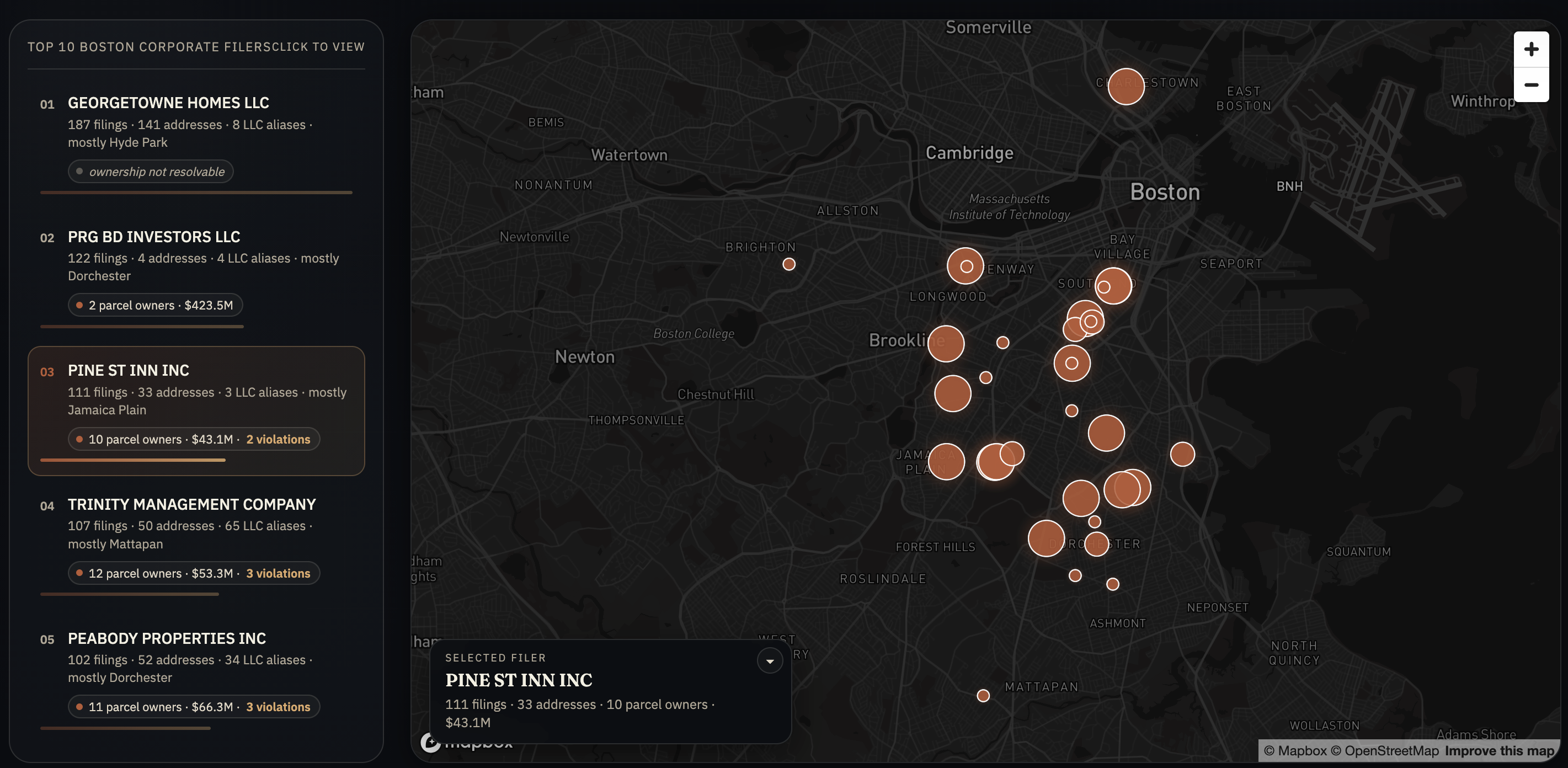
Interactive data visualization exploring eviction activity in Boston through neighborhood patterns, landlord behavior, and housing instability signals.
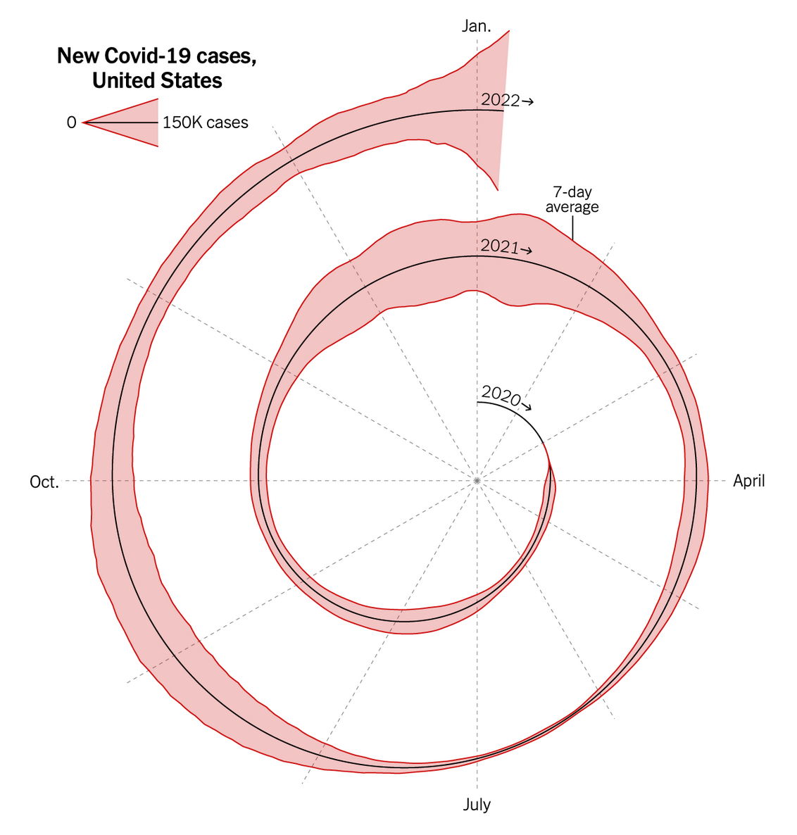
A critique and redesign of the NYT spiral COVID-19 chart. Features an interactive 3D terrain visualization built with Three.js mapping case volume and fatality rate.
An exploratory data analysis of the Boston Housing dataset. Interactive Plotly charts examine correlations between socioeconomic factors and median home values.
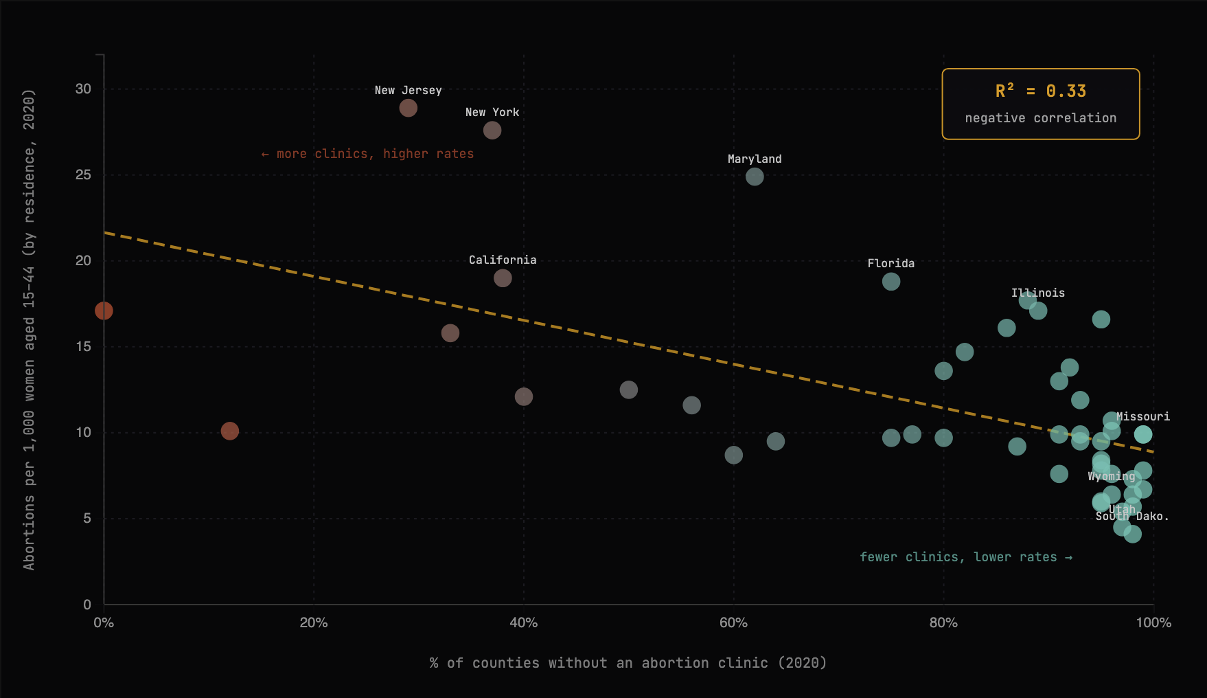
A persuasive visualization exploring how state-level abortion restrictions force patients to travel across borders, using dumbbell charts and scatter plots built with D3.