Redesigning the COVID-19 Spiral
Step 1 · Reading the Visualization
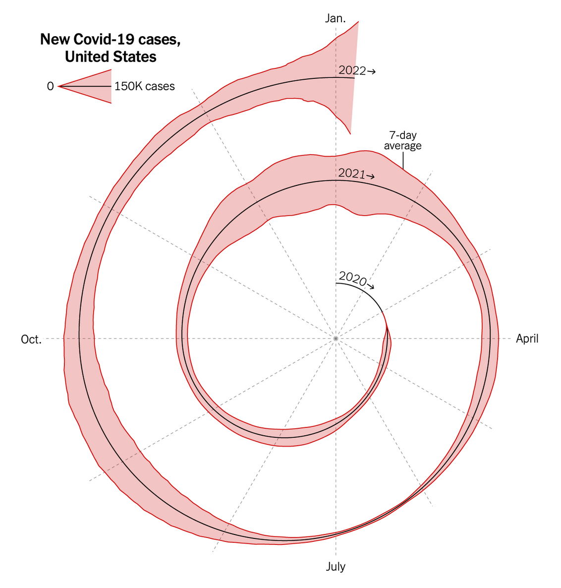
The original visualization, published by the New York Times, uses a spiral form to display daily new COVID-19 cases in the United States from early 2020 through January 2022. Each revolution of the spiral represents one calendar year, with months marked along radial axes. The radial distance from the center encodes the volume of new daily cases, and a pink band represents a range which is likely the raw daily counts.
Key Insights from the Data
- Omicron dwarfed all previous waves: The January 2022 peak (the outermost spike near the top of the spiral) reached over 1.4 million daily new cases at its apex, roughly 5× larger than any prior wave. This is the most visually dramatic feature of the spiral.
- Winter surges are a recurring pattern: Each year shows a pronounced case spike in the December–January period: the winter 2020–21 wave (~300K daily cases), the Delta-driven late 2021 surge, and the historic Omicron wave of January 2022. The seasonal pattern is one thing the spiral form communicates well.
- The summer 2021 Delta wave: A visible bulge near the July mark of the 2021 ring shows the Delta variant surge, which peaked around 150–200K daily cases which is significant but modest compared to the winter waves.
Step 2 · Critique of the Original Design
The spiral visualization is visually striking and succeeds as an attention-grabbing editorial piece. The choice to wrap time in a spiral rather than a line makes seasonal comparison intuitive: you can see at a glance that winter months consistently produce surges. The dramatic outward spike of the Omicron wave in January 2022 creates a powerful visual metaphor for how the variant "broke the pattern" of prior waves, and the gradual widening of each annual ring communicates escalation without needing to read any numbers. The labeling is minimal but functional, and the visual hierarchy (bold title, subtle month labels, year annotations along the spiral) guides the reader's eye from the outside in.
However, the spiral form introduces several readability challenges. First, radial distance is one of the least accurate visual encodings for quantitative comparison. It is very difficult to judge whether the summer 2021 Delta wave was 60% or 80% as large as the winter 2020–21 surge. Second, the wide pink band adds visual noise without a clear legend explaining what it encodes. Third, the scale reference is disconnected from the data and easy to overlook, making it hard to attach concrete numbers to the visual. Finally, the reading order is unintuitive: does one start at the center (chronological beginning) or the outside (the most dramatic feature)? I noticed the Omicron spike first but then had to mentally rewind to the center to reconstruct the chronological narrative, creating cognitive friction. A linear time axis would resolve most of these issues at the cost of sacrificing the spiral's seasonal-comparison affordance and editorial punch.
Step 3 · Sketches
Rationale
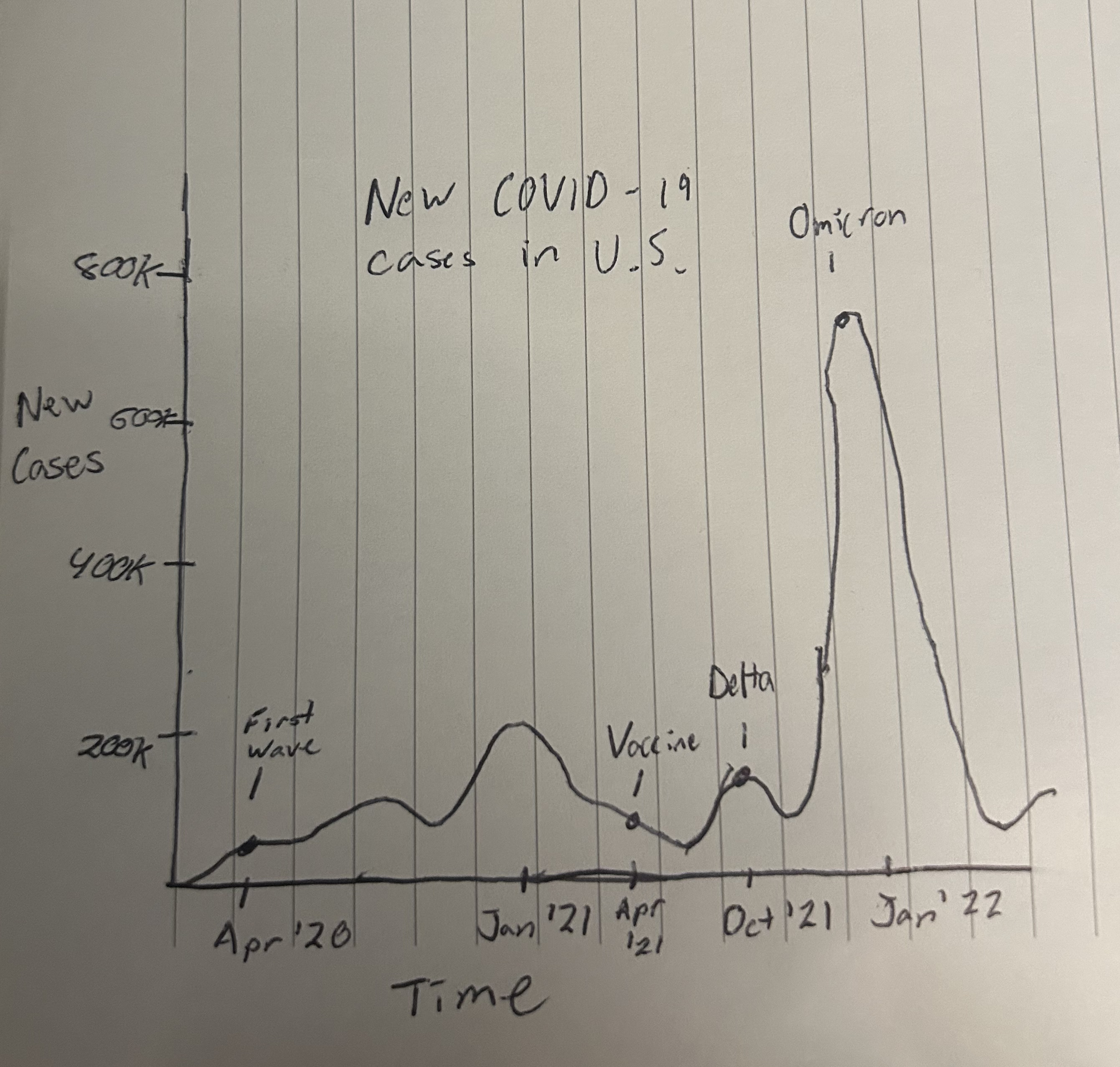
- Motivation: I wanted to use a standard line chart with a linear time axis to address the readability issues of the spiral.
- Intended message: I wanted to communicate the cyclical, year-over-year nature of pandemic waves and the dramatic Omicron wave in January 2022.
- What worked: The linear time axis is easy to read and understand.
- What didn't: The spiral is more visually striking and engaging than the line chart.
- Next exploration: I would like to explore a faceted area chart to compare the different waves year by year.
Rationale
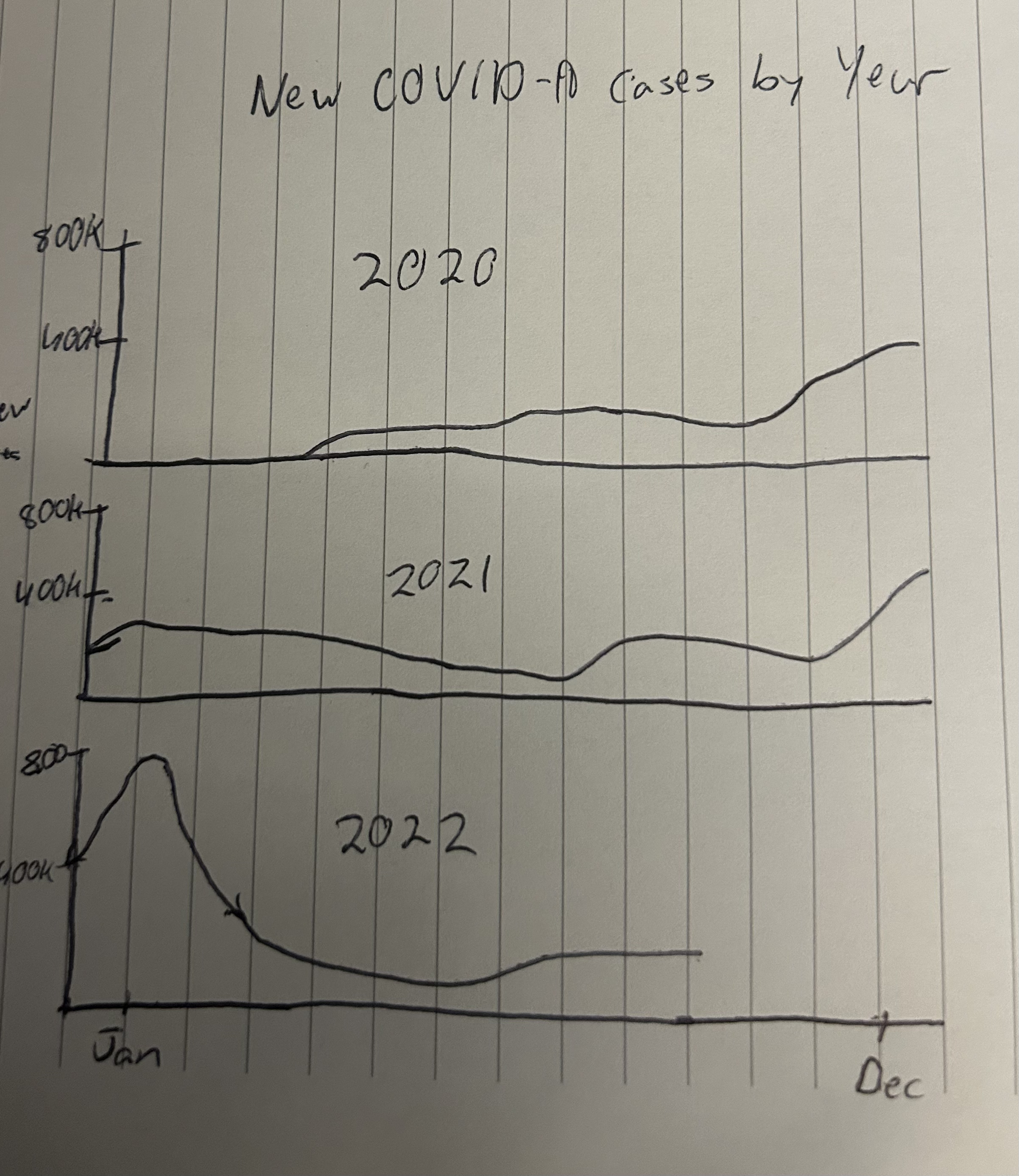
- Motivation: I wanted to use a faceted area chart to compare the different waves year by year.
- Intended message: I wanted to communicate the cyclical, year-over-year nature of pandemic waves and the dramatic Omicron wave in January 2022.
- What worked: The faceted area chart is easy to read and understand.
- What didn't: The spiral is more visually striking and engaging than the faceted area chart.
- Next exploration: I would like to explore a nonlinear chart type to match the engagement of the spiral.
Rationale
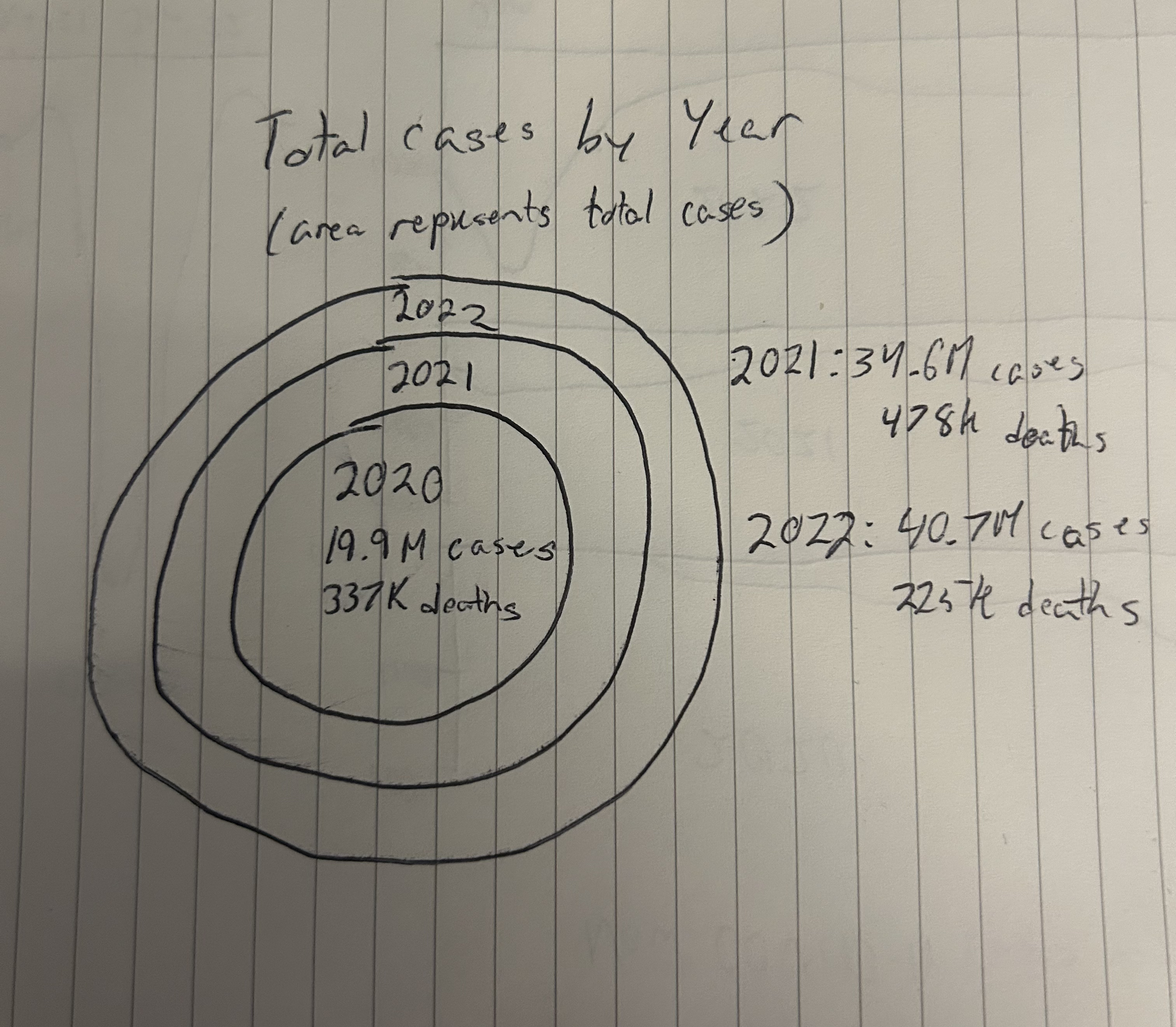
- Motivation: I wanted to use a non chronological approach to show how the COVID cases grew year after year.
- Intended message: I wanted to communicate how the number of cases grew with each passing year.
- What worked: The circles are visually effective in how they demonstrate the total amount of cases being the area.
- What didn't: Hard to draw these circles whose area represents a numerical value accurately. Also hard to label the circles.
- Next exploration: I'd like to put all these together to form a overall appealing graph without sacrificing numerical accuracy while maintaining visual appeal.
Step 4 · Final Visualization
Step 5 · Design Rationale & Reflection
My final visualization uses a 3D terrain metaphor to communicate two central messages: (1) the sheer scale difference between the Omicron wave and all prior surges, and (2) the divergence between case volume and lethality over the course of the pandemic. Each of the three years (2020, 2021, 2022) is rendered as a separate ribbon of terrain arranged along the depth (Z) axis, with time-of-year running left to right (X axis) and case volume mapped to vertical height (Y axis). I applied a square-root scale to the height encoding so that the enormous Omicron peak does not flatten the earlier waves into invisibility, while still preserving a clear sense of magnitude difference. The second encoding layer is color: each point on the terrain surface is colored by the case fatality rate (deaths ÷ cases), using a blue-to-yellow-to-red gradient. This dual encoding allows the viewer to immediately see that early 2020, though modest in case volume, was the deadliest period per infection, while the towering Omicron ridge is predominantly blue, reflecting its far lower fatality rate. I chose a 7-day rolling average as a data transformation to smooth out the severe day-of-week reporting artifacts (weekends consistently underreported). The interactive orbit controls let the viewer rotate and zoom to compare years from different angles, partially compensating for the occlusion inherent in any 3D representation. However, the 3D perspective does obscure precise quantitative comparison and the back ribbons (2020) can be partially hidden behind the front ones depending on the viewing angle. Additionally, the choice to separate years into discrete ribbons rather than a continuous surface means the late-December-to-January transition between years (where the winter 2020–21 surge and the Omicron onset both occurred) is visually split across two ribbons.
Reflecting on the critiques I raised in Step 2, the 3D terrain design directly addresses several of them while failing to resolve others. My primary critique of the NYT spiral was that radial distance is a poor encoding for quantitative comparison. The terrain's vertical height channel is more perceptually accurate, especially with the sqrt scale preserving visibility of smaller waves. The spiral's lack of a clear scale reference is addressed here through labeled height markers and the interactive ability to zoom in on specific regions. The spiral's ambiguous reading order (center-out vs. outside-in) is replaced by a natural left-to-right, front-to-back arrangement that follows both chronological time and calendar alignment simultaneously. However, the process of critique-by-redesign revealed a fundamental tension I had not anticipated: the spiral's greatest strength — its ability to overlay years concentrically for direct seasonal comparison — is actually difficult to replicate in any alternative layout. I also discovered that my critique of the spiral's "visual noise" from the pink band was somewhat unfair; when I attempted to encode a second variable (fatality rate via color), I introduced my own form of visual complexity that demands explanation. Ultimately, this redesign process taught me that the spiral was a more carefully considered design than my initial critique suggested: its weaknesses in precision were deliberate tradeoffs for editorial impact and seasonal-comparison affordance, and any alternative that tries to improve on one axis inevitably sacrifices something on another.